
Context & Data Retrieval
The problem under study is hospital readmission for a nationwide health chain. Readmission is an unfavorable outcome wherein patients are discharged and then readmitted a short time later. This leads to wasted hospital resources as well as health complications1. The stated goal of the data set, which was originally proprietary to my grad school and thus unavailable for public consumption, is to assess the extent to which readmission is a problem for this network2. The data dashboard submitted herein adequately answers the question at a nation- and statewide level as much as can be done from the sample size provided.
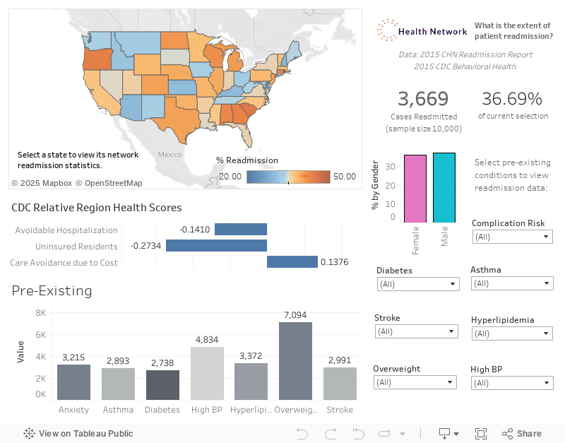
We have additionally retrieved and cleaned 3 key metrics from the United Health Foundation.3 For purposes of the scenario, it has been assumed from context clues in the data dictionary that the hospital data under consideration is from 2015 and so the outside data that has been retrieved is the 2015 Annual Health Review. The three metrics that were retrieved from this set were the relative state scores for patients that avoided care due to cost, for those that were hospitalized despite it not being necessary, and for proportion of uninsured residents. The reason statewide data was chosen is that there was not enough county-level data in the original set, and it was hypothesized that they may be related to network readmission trends. This data was cleaned and separated into three data frames before being combined in Tableau with the network medical dataset. The additional data is linked to the original data by the state field.
Using the Dashboard

As the stated purpose of the data set was to "investigate the extent to which readmission is a problem for this chain of hospitals"2, the main point of interest is the upper-right corner which features the count of readmissions and the percentage of all cases that the figure represents. By default, it reads 3669 readmissions which accounts for 36.69% of all cases: there were exactly 10,000 cases provided in the cleaned sample set.
Immediately to the left is the nationwide map which indicates the severity of the problem as aggregated by state. It shows that South Carolina has the highest rate of readmission for this hospital network, the darkest shade of orange representing 46.15% of all cases. New Hampshire has the minimum rate of 26.58%. This map can be used to identify regional trends.
Additional indicators of immediate interest are the incidence of various pre-existing conditions in admitted patients in the lower left, the overall US scores for the three outside metrics introduced earlier in the mid-left, and the gender count and percentage breakdown for readmissions under the primary count This metric reveals a gender imbalance in some states: clicking between the male and female options immediately reveals that many states change color, reflecting a dramatic change in readmission statistics depending on which gender is under study. For instance, Wyoming shows that men are associated with 32% higher readmission than women. This is a striking feature of the exploratory research into this problem that warrants further study.
Stakeholders may click on a state to view every given measure as pertaining to that state. This is the primary interactive feature of the dashboard. Clicking on South Carolina, the worst state for readmission, reveals that this state ranks preferably in terms of patients that avoid care due to cost: turning down medical care due to cost concerns is not as much of a problem in this state relative to others. Finally, we see that the relative sizes of pre-existing condition bins do not deviate significantly from the nationwide distribution. Further investigating the states reveals that obesity is the most common condition in all of them by a significant margin.
An additional major control is the array of pre-existing conditions and complication risks in the lower right. For example, setting the hyperlipidemia filter to 'Yes' for patients with this disease reveals that Connecticut’s rate of readmission rises dramatically, to over 70% becoming the worst performing state for the network. Stakeholders may investigate any combination of pre-existing conditions that were provided in the original data set and the bar graph of conditions may reveal correlations that merit further study.
Other available controls include segmentation by gender, by clicking on the desired bar graph segment for male, and female. The dashboard is usable by people with colorblindness because the only color palette utilized was Tableau's built-in set specifically for said audience. The map features a diverging color palette rather than a sequential one for this purpose.
It has been stated that the audience consists of stakeholders at the management level of this hospital network, who should have a passing familiarity with the light medical terminology and readmission-related issues discussed in the worksheet and who are interested in the overall extent of readmission. The SVP must make actionable decisions based on trends observed in the dataset. The VP should formulate additional research that the viz lays out in an exploratory way. VPs at the regional level will be present at the meeting where this visualization is shown and would be interested in how their region is performing compared to others.
In conclusion, the visualization meets the needs of the organization by automating the initial exploration phase into the demographic factors that are correlated with hospital readmission within this health network.
Sources
1"Hospital Readmissions". Agency for Healthcare Research and Equality. https://www.ahrq.gov/topics/hospital-readmissions.html. Accessed 28 July 2022.
2"D210 Medical Data Considerations and Dictionary.". Western Governors University. https://tasks.wgu.edu/student/010346234/course/23540008/task/2804/overview. Accessed 19 July 2022.
3"2015 Yearly Report". United Health Foundation. https://www.americashealthrankings.org/explore/annual/measure/Overall/state/ALL?edition-year=2015. Accessed 19 July 2022.